This week we’re going to finish up the portfolio slider on our homepage that we have already started.
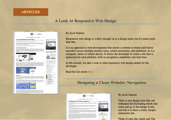
At this point, if you view your index.php file and scroll down to the secondary screen it should look something like this.

We’re close, all we have to do now is plug in our jQuery elements and then add some CSS to make our secondary portfolio slider screen responsive.
Go ahead and download the Java files you’ll need from here, keep the js directory in your root folder and check out what out the image below to see what your finished product will look like.
Let’s begin in our index.php file. The first thing we’re going to do is add some links inside our heading that point to our java scripts. These are the jQuery and JavaScript’s that power our slider. As you can see I sandwiched mine between the link to my style sheet and the closing of the head tag.
<link href="main.css" rel="stylesheet" type="text/css" />
 <script src="js/jquery-1.2.1.pack.js" type="text/javascript"></script>
 <script src="js/jquery-easing.1.2.pack.js" type="text/javascript"></script>
 <script src="js/jquery-easing-compatibility.1.2.pack.js" type="text/javascript"></script>
 <script src="js/coda-slider.1.1.1.pack.js" type="text/javascript"></script>

    <script type="text/javascript">
  jQuery(window).bind("load", function() {
   jQuery("div#slider1").codaSlider()
   // jQuery("div#slider2").codaSlider()
   // etc, etc. Beware of cross-linking difficulties if using multiple sliders on one page.
  });
 </script>

</head>
At this point you should have a fully functioning slider, but it’s not quite responsive yet. To make our slider responsive we just have to add a few more things in our media queries and we’ll be done. First up will be our media query for landscape view tablets with a max width of 1024 px, all we need to do is add our #mainBG2 tag under our #mainBG tag.
#mainBG2 {
 border-top:10px solid #EDEAE5;
 background: url(images/medium2.jpg) no-repeat scroll;
 background-position:center;
 background-size: cover;
 -webkit-background-size: cover;
 -moz-background-size: cover;
 -o-background-size: cover;
}
Follow that up by doing the same in our min-width: 768px / max-width: 991px, tablet portrait view query.
#mainBG2 {
 border-top:10px solid #EDEAE5;
 background: url(images/medium2.jpg) no-repeat scroll;
 background-position:center;
 background-size: cover;
 -webkit-background-size: cover;
 -moz-background-size: cover;
 -o-background-size: cover;
}
Finally, our mobile view query for displays ranging from 0px to 767px wide is going to take a little more work than the others. I started by making the size of my h3 font a little smaller, so that it viewed properly on a mobile device. Next I added the #mainBG2 tag so that it would load the small version of our background image. Then I resized the class .stripViewer, panelContainer, and .panel so that our portfolio slider would display properly on a mobile device. Next, I modified the “.wrapper img” class to hide our large image and the “.warpper p” class to make our text a little smaller, and finally told the “.hideSmall img” class to display our smaller image, now that we hid the larger one.
h3 {font-size:.9em;}

#mainBG2 {
 border-top:10px solid #EDEAE5;
 background: url(images/small2.jpg) 50% 0 no-repeat scroll !important;
 background-size: cover !important;
 height:500px;
 padding-bottom:0;
}
.articlesHeader {
 font-size:.8em;
}
.stripViewer { /* This is the viewing window */
 width:300px;
 overflow:hidden;
 height:388px;
}
.stripViewer .panelContainer .panel { /* Each panel is arranged end-to-end */
 width:300px;
 overflow:hidden;
}
.wrapper img {
 display:none;
}
.wrapper p {
 font-size:.7em;
 line-height:1em;
 margin:5px 25px;
}
.hideSmall img {
 display:block;
 margin:0 0 10px 12px;
}
That does it for your mini-portfolio slider, check your work and see how it looks. This should be a quick and easy way to keep prospective clients and visitors on your page, and encourage them to keep clicking through your site.
If you’d like to download the full source code for our tutorial up to this point you may do so here.


Post a Comment